
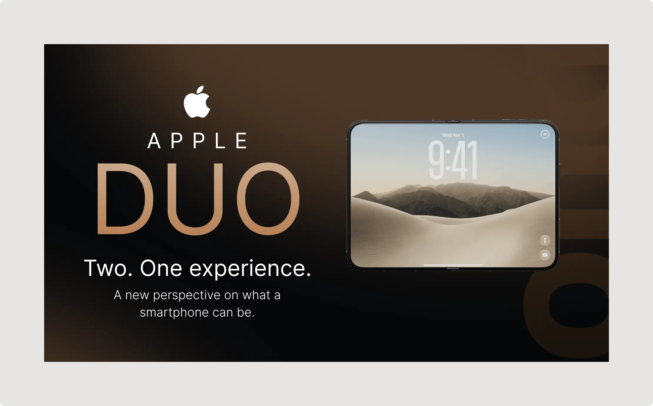
Smartphone Product Presentation UI gives your product story a polished, high-impact stage with cinematic visuals, bold typography, and a sophisticated technology-focused composition. Designed for modern Figma workflows, this presentation concept makes it easier to showcase a digital product, mobile experience, or upcoming device with clarity and premium visual appeal.
The design combines a dramatic dark background with warm neutral tones, oversized editorial typography, and a large smartphone mockup as the central visual focus. The composition creates a strong contrast between the presentation message and the product imagery, helping viewers understand the concept quickly while maintaining a refined, luxury-tech aesthetic.
Smartphone Product Presentation UI Features
- Premium product showcase: A large smartphone mockup creates an immediate visual focal point for product demonstrations and launch presentations.
- Strong visual hierarchy: Oversized typography, supporting copy, and generous spacing make the core message easy to scan.
- Figma Auto Layout workflow: Structured layouts can be adapted using Auto Layout principles for easier spacing, alignment, and responsive editing.
- Global variables: Use Figma variables to establish reusable values for colors, spacing, typography, and other design tokens across related slides.
- Flexible presentation structure: Replace the headline, supporting copy, device artwork, and background imagery to create a presentation tailored to your brand.
- Modern dark-mode aesthetic: The dark canvas and restrained palette create a premium visual direction suited to consumer technology and digital products.
- Presentation-ready composition: The balanced arrangement works especially well as a hero slide, opening slide, product reveal, or key message section in a pitch deck.
The visual language is especially effective for brands that want to communicate innovation without overwhelming the audience. The combination of minimal copy, a prominent product image, and carefully controlled negative space gives the slide an editorial feel that can work across startup decks, product launches, agency presentations, and technology marketing materials.
For designers building or extending the component in Figma, Auto Layout can help maintain consistent spacing as content changes. Figma’s official Auto Layout documentation provides additional guidance for creating adaptable layouts. For Apple-platform projects, the Apple Design resources can also provide useful reference material for interface and presentation direction.
The component can be adapted beyond smartphone presentations. Swap the device mockup for a SaaS dashboard, mobile application, wearable device, software interface, or other digital product while retaining the same strong visual hierarchy. It can also serve as a foundation for a larger presentation system with matching product overview, feature, comparison, and closing slides.
Best For
- Technology startups and founders creating investor pitch decks
- Product designers presenting new mobile applications or digital products
- Creative agencies preparing premium client presentations
- Consumer technology brands planning product launches
- UI/UX designers showcasing mobile interface concepts
- Marketing teams building product-focused presentation decks
- Freelancers creating polished technology presentation templates
- Design teams developing reusable Figma presentation systems
Use this Smartphone Product Presentation UI as a high-impact opening slide or adapt its visual system across an entire product narrative. Its clean structure makes it easy to introduce a product, establish a premium brand impression, and transition into more detailed feature or interface slides.
Explore more presentation-focused resources through our Pitch Decks collection or discover additional presentation components in our Presentation Kits collection. Build a cohesive deck by pairing this hero composition with supporting product, feature, and results slides.