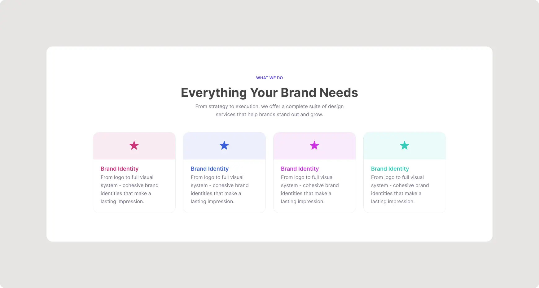
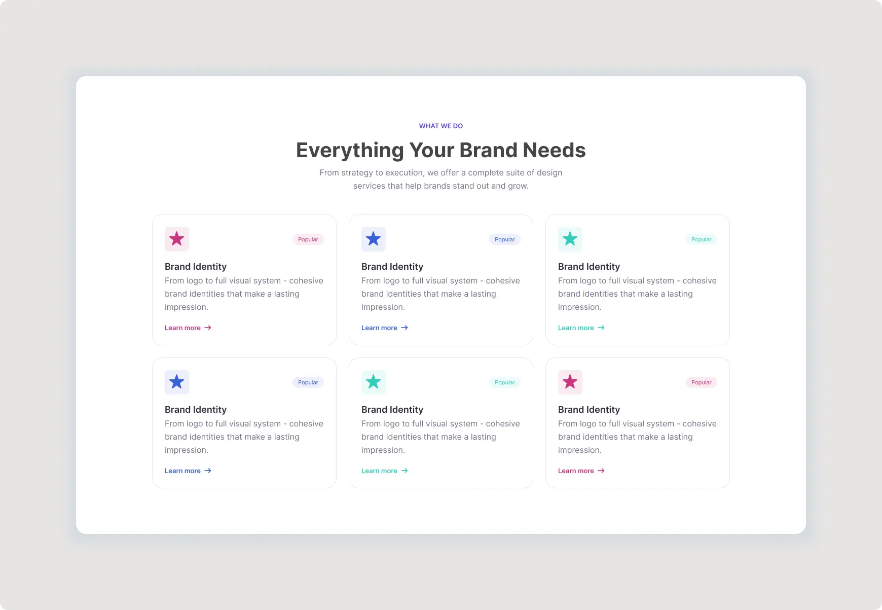
Brand Services Section UI is a premium Figma website component designed to showcase creative and professional services in a clean, organized, and visually engaging layout. Featuring six reusable service cards, colorful icons, popular badges, supporting descriptions, and clear call-to-action links, this section is ideal for agencies, startups, creative studios, branding businesses, and professional service websites.
The balanced grid structure creates a strong visual hierarchy while giving each service enough space to communicate its value. Every major element can be customized in Figma, allowing you to update service names, descriptions, icons, colors, badges, and links to match your brand identity.
Brand Services Section UI Key Features
This modern website component is designed for designers who want a professional services presentation without building the layout from scratch.
- Fully editable Figma design
- Clean and modern service card layout
- Six reusable service cards
- Figma Auto Layout for flexible spacing and resizing
- Global Variables for consistent design properties
- Reusable Components for efficient customization
- Colorful icon variations for visual differentiation
- Popular badges for highlighting important services
- Clear call-to-action links
- Well-organized spacing and alignment
- Professional typography hierarchy
- Suitable for responsive website layouts
- Easy to adapt to different industries and brands
Modern Figma Services Section for Websites
A well-designed services section helps visitors quickly understand what a company offers. This Figma Services Section uses a structured card-based layout to separate individual services while maintaining a consistent visual language throughout the page.
The spacious design works particularly well for creative agencies, branding studios, marketing companies, technology businesses, consulting firms, freelancers, and startups. Replace the sample content with your own services, add your brand colors, and customize the icons to create a personalized website section.
Flexible Service Cards UI Design
Each service card provides dedicated space for an icon, service title, short description, badge, and call-to-action. This makes the component easy to scan and gives visitors a clear path toward learning more about each service.
The reusable card structure also makes it simple to add, remove, or rearrange services as your website content evolves. Designers can maintain consistent spacing and styling while quickly adapting the section for different projects.
Best For
- Creative Agencies
- Branding Studios
- Digital Marketing Agencies
- Design Agencies
- Web Design Studios
- Technology Startups
- Consulting Businesses
- Freelance Designers
- Professional Service Businesses
- Corporate Websites
Easy to Customize in Figma
The component is structured to make customization straightforward. Update the typography, colors, icons, service descriptions, badges, and links while keeping the original layout organized and consistent.
Figma Auto Layout can help maintain spacing and alignment when content changes. For additional guidance, explore Figma’s official Auto Layout documentation.
You can also use established interface design principles from the Material Design guidelines when adapting this component for your own website.
Explore More ProFigma UI Templates
Discover more website components in our UI Components collection or explore additional Buttons & Cards designs to build a consistent interface for your next project.
Why Choose This Services Section?
This premium website component saves valuable design time while providing a polished foundation for presenting business services. Its reusable cards, clean typography, organized spacing, and flexible structure make it suitable for a wide range of modern websites.
Whether you are designing a creative agency website, startup landing page, portfolio, or corporate service page, this component gives you a professional starting point that can be customized quickly in Figma.