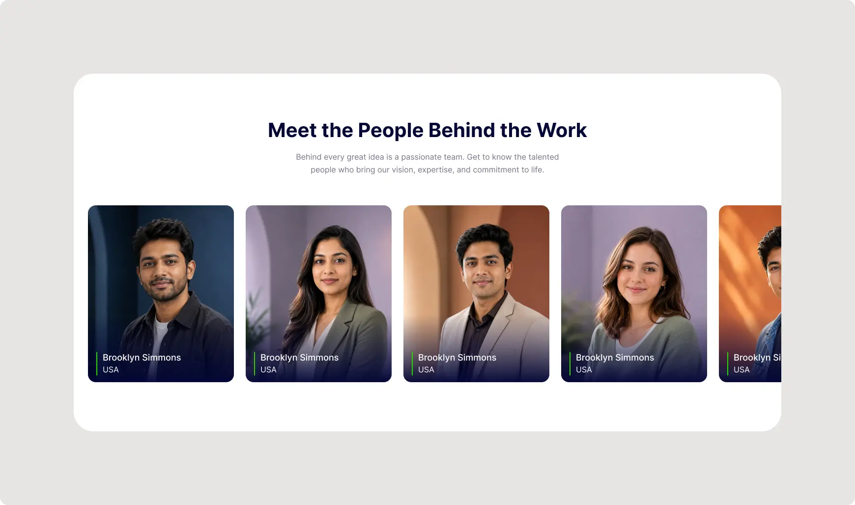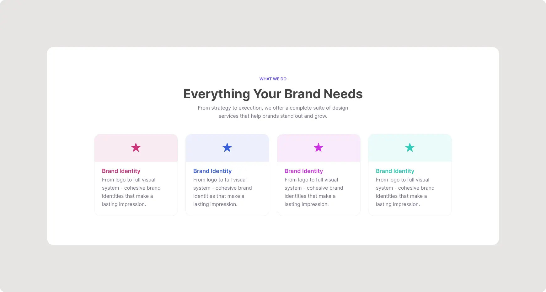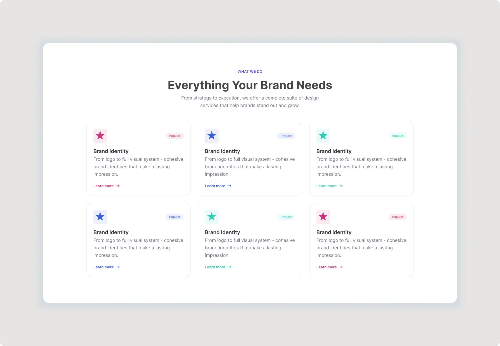

Business Website Hero Section UI is a premium Figma website component designed to create a strong first impression for modern businesses, SaaS companies, technology brands, agencies, and professional service providers. The layout combines a bold headline, supporting description, primary and secondary CTA buttons, trusted customer avatars, and a professional workspace visual to communicate value clearly above the fold.
This clean hero design gives visitors an immediate understanding of what your business offers while providing clear actions such as booking a call or learning more. The balanced composition makes the component easy to adapt to different landing pages, corporate websites, startup websites, and digital product experiences.
Business Website Hero Section UI Key Features
This modern Figma component is built around a clear visual hierarchy and conversion-focused structure, making it a practical starting point for professional website designs.
- Fully editable Figma design
- Bold and attention-grabbing hero headline
- Supporting description for business messaging
- Primary CTA button for important actions
- Secondary CTA button for additional navigation
- Trusted customer avatar section
- Professional workspace and technology visual
- Figma Auto Layout for flexible spacing and resizing
- Global Variables for consistent design properties
- Reusable Components for faster customization
- Clean typography hierarchy
- Modern rounded-corner visual treatment
- Flexible structure for responsive website layouts
- Easy customization for different industries
Modern Figma Hero Section for Business Websites
A well-designed hero section communicates a website’s main value proposition within seconds. This Figma Hero Section uses a combination of concise messaging, strong typography, contrasting CTAs, and a relevant visual to establish a professional first impression.
The two-column composition provides enough space for business messaging on one side while using a large supporting image on the other. This approach works especially well for companies offering digital solutions, software, consulting, marketing, technology, design, and professional services.
Conversion-Focused Landing Page Hero
The CTA structure gives visitors a clear next step without making the interface feel crowded. A prominent primary button can be used for actions such as booking a consultation, starting a free trial, requesting a quote, or contacting a sales team, while the secondary button can direct visitors toward additional information.
The trusted customer element adds a useful social-proof area beneath the primary actions. You can replace the sample avatars and text with your own customer information, review count, client logos, or other credibility indicators.
Flexible Website Hero Design
Every major visual element can be adapted to match your brand identity. Update the headline, supporting content, CTA labels, imagery, typography, colors, and customer information to create a personalized landing page experience.
The spacious layout also provides a strong foundation for responsive design. Designers can reorganize the content into stacked sections for smaller screens while preserving the original visual hierarchy and user flow.
Best For
- SaaS Companies
- Technology Startups
- Digital Agencies
- Consulting Businesses
- Professional Service Companies
- Software Companies
- Marketing Agencies
- Creative Studios
- Corporate Websites
- Business Landing Pages
Easy to Customize in Figma
This component is designed for a smooth Figma workflow. Designers can replace the hero image, edit text, change CTA labels, update colors, modify typography, and customize customer avatars without rebuilding the entire section.
Figma Auto Layout can help maintain consistent spacing as content changes. Learn more about flexible layouts through Figma’s official Auto Layout documentation.
For additional interface design guidance, explore the Material Design guidelines when adapting the component to your own website and design system.
Explore More ProFigma UI Templates
Build a complete website with more resources from our UI Components collection, or explore additional Hero Sections for landing pages, SaaS websites, agencies, and professional businesses.
Why Choose This Hero Section?
This premium website component saves design time while providing a polished foundation for presenting a business or digital product. Its strong headline, supporting copy, CTA buttons, trust element, and professional visual create a complete above-the-fold experience without unnecessary complexity.
Whether you’re designing a SaaS landing page, technology website, consulting platform, agency site, or corporate homepage, this component provides a flexible starting point that can be customized quickly in Figma.
Use this modern hero section to communicate your value clearly, guide visitors toward meaningful actions, and create a professional first impression for your digital brand.