The Figma Button Component UI Kit is a meticulously crafted Figma resource designed to give your product interface a consistent, professional button system from day one. Created for modern SaaS applications, web platforms, and mobile apps, this kit eliminates the time-consuming task of designing every button variant from scratch. With every interaction state accounted for — default, disabled, and loading — you get a battle-tested component library that integrates seamlessly into any design system workflow.
What Makes This Figma Button Component UI Kit the Best Choice
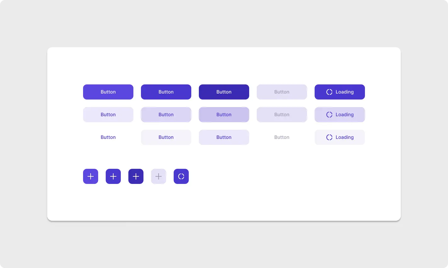
At its core, this kit is built around three carefully considered button styles: Filled (solid background for primary actions), Soft (light lavender background for secondary actions), and Ghost (transparent for tertiary or inline actions). Each style spans five purple-to-navy colour intensity levels, giving you precise control over visual hierarchy without ever breaking the design language. The result is a system that feels cohesive no matter how many button types appear on a single screen.
Beyond rectangular buttons, the kit includes a complete set of square icon-only buttons — ideal for FAB-style interactions, toolbar icons, and compact action menus. Combined with the loading state (clear spinner indicator) and the disabled state (muted lavender for obvious affordance), this kit handles every real-world UI scenario with confidence and precision.
Solid purple backgrounds for primary CTAs and high-priority actions that demand immediate user attention.
Light lavender backgrounds for secondary actions that support the primary CTA without competing for attention.
Transparent style for tertiary actions, inline links, and low-emphasis supporting interactions.
✦ Key Features
- ⚡ Figma Auto Layout — Built with Figma Auto Layout so every button resizes intelligently as text or padding changes — zero manual adjustments needed.
- 🎨 Global Variables & Styles — Swap your brand colour in one place and every button variant updates instantly across the entire file.
- 🗂️ Organised Layers — Every layer is named, grouped, and structured for clean developer handoff and smooth team collaboration.
- 🔄 All Interaction States — Default, Disabled, and Loading states included for every variant — no gaps in your design specification.
- 📐 Icon-Only Square Buttons — FAB-style and toolbar icon buttons included, perfectly matching the rectangular button style system.
- 📱 Cross-Platform Ready — Structured for web dashboards, SaaS platforms, and mobile app design systems without modification.
Great UI design is about clarity and accessibility as much as aesthetics. This Figma Button Component UI Kit is structured in alignment with the interaction principles outlined in the Material Design 3 Button guidelines, ensuring every state communicates the correct affordance. The disabled state uses a clearly muted lavender to signal inactivity, and the loading state provides immediate visual feedback — both critical for reducing user confusion in high-interaction SaaS interfaces where responsiveness directly affects trust.
🎯 Best For
- ✔ SaaS product designers building scalable design systems
- ✔ Freelance UI/UX designers on web & app projects
- ✔ Frontend developers referencing Figma for coded components
- ✔ Startup teams who need a polished UI foundation fast
Stop rebuilding the same button component from scratch on every project. Download this Figma Button Component UI Kit today and plug it directly into your next design system — every variant, every state, every style already built and waiting. Browse all Button & Card UI Kits on ProFigma and discover more components that save you hours every sprint.