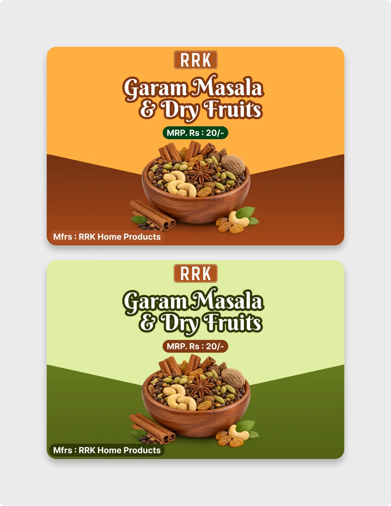
Streamline your food branding workflow with this professionally crafted Spice and Dry Fruit Packaging UI component, designed exclusively to elevate physical products and digital marketplaces alike.
Whether you are designing for a local brand or showcasing premium products on an e-commerce platform, presentation is everything. This ready-to-use vector component delivers an excellent layout balance, combining typography, imagery spacing, and regulatory fields like pricing and manufacturer details into a cohesive grid system.
Built completely with modern asset standards in mind, this package complies with standard design practices. The layout aligns beautifully with global digital scaling principles, matching the meticulous asset construction found in the official Material Design guidelines. By utilizing this framework, you ensure your designs translate seamlessly across both physical print formats and web displays.
Why Choose Our Spice and Dry Fruit Packaging UI?
Creating a shelf-ready design from scratch is time-consuming. Our premium Spice and Dry Fruit Packaging UI template solves this problem by giving you a bulletproof, mathematically aligned starting point. With a focus on typography hierarchy and vibrant imagery presentation, your client presentations will look incredibly professional in seconds.
Every element in this asset is crafted for maximum speed and editability. The text layers are organized systematically, allowing you to update brand names, product variants, and price points without breaking the container balance. This ensures that the Spice and Dry Fruit Packaging UI remains flexible under any design constraint.
Advanced Figma Engineering Features
- Dual-Color Variations: Switch instantly between rich warm spice tones (orange/brown) and fresh organic variants (light/dark green) included right in the file.
- Figma Auto Layout 5.0: Enjoy effortless, responsive scaling across different label sizes and packaging aspect ratios. Learn more about modifying these components by exploring Figma’s official Auto Layout documentation.
- Organized Component Layers: Fully grouped, named, and nested structures make finding and replacing asset elements a breeze.
- Print & Web Ready: Perfectly calibrated vectors that look razor-sharp on web mockups and high-resolution print exports.
How to Customize the Spice and Dry Fruit Packaging UI
We designed this asset to be as user-friendly as possible. To customize, simply open the file in Figma, select the vector elements, and swap out the placeholder imagery with your own high-resolution renders. The layout utilizes native Google Fonts, allowing you to edit the text headers while keeping the overall design perfectly balanced.
If you want to achieve a highly unified visual system, you can combine this pack with our other UI kits. The grid layout used in this template perfectly complements our modular web components, making it incredibly easy to build a matching online storefront to market your physical products.
Best Suited For:
This design kit is versatile enough to cover multiple industries and professional project workflows, including:
- FMCG & Grocery Brands: Perfect for traditional spice labels, dry fruit assortments, organic pulses, and herbal mixes.
- E-commerce Marketplaces: Ideal for building highly engaging product card previews and catalog thumbnails.
- Agencies & Freelancers: Save hours of time presenting premium visual concepts directly to consumer brand clients using a production-grade Spice and Dry Fruit Packaging UI structure.
Explore our full collection of versatile assets by checking out our dedicated Marketing & Print Components to supercharge your design library today.