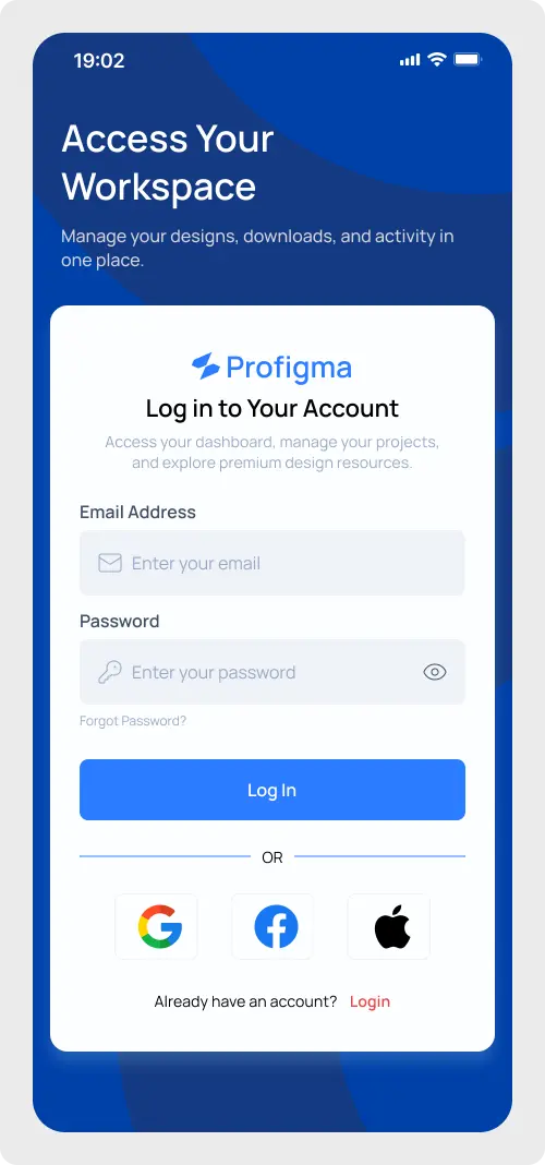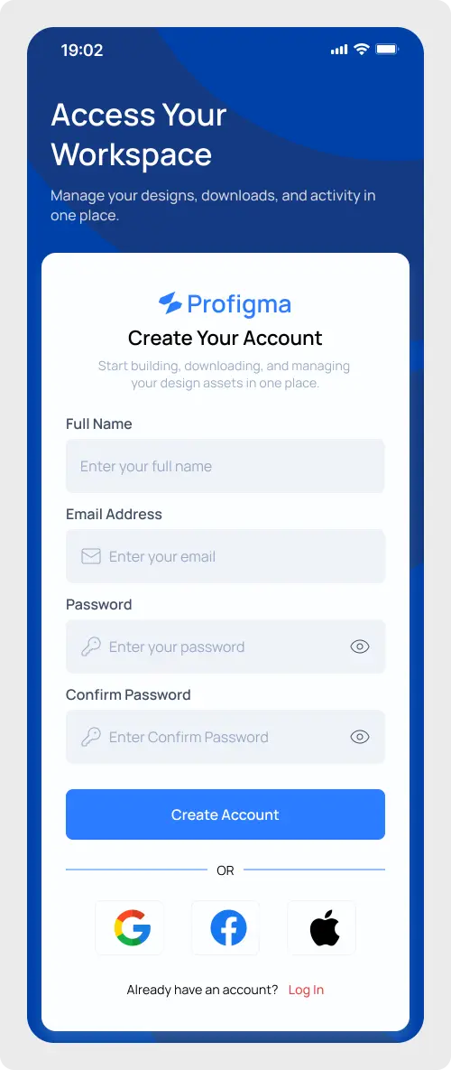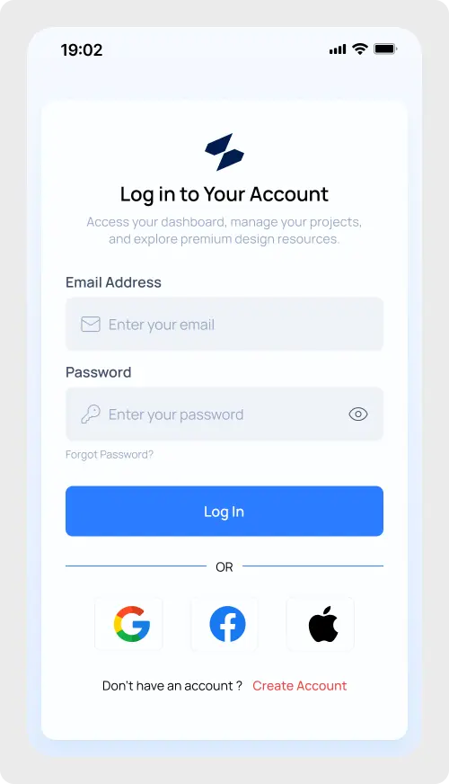
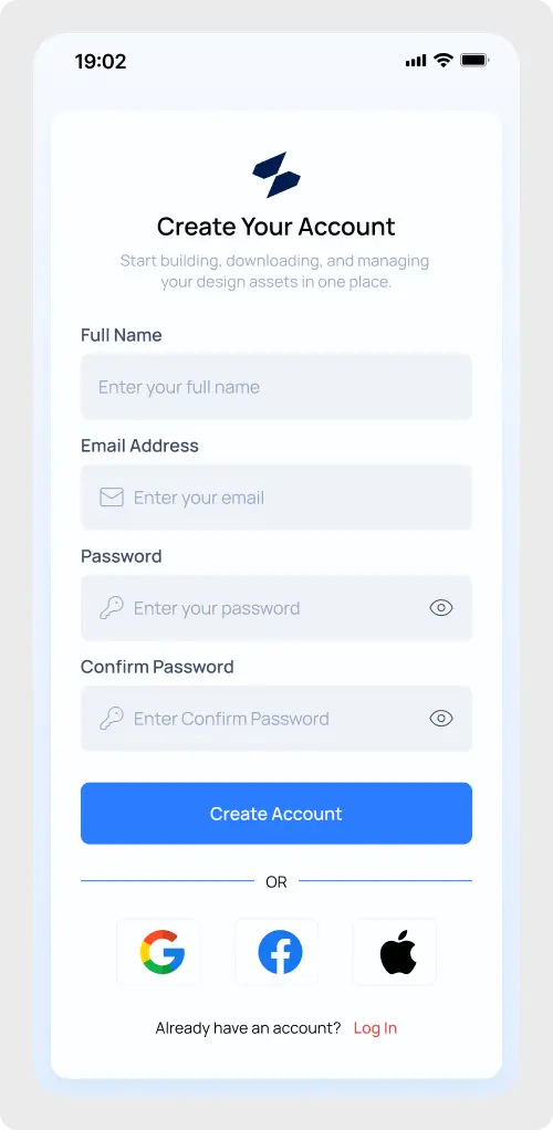
Accelerate your application’s onboarding experience with our premium mobile sign-up screen UI, meticulously crafted for Figma.
Whether you are building a SaaS platform, an e-commerce application, or a productivity tool, providing a frictionless registration process is critical for user conversion. This highly optimized, pixel-perfect template gives you a massive head start on your design workflow, allowing you to focus on core product features rather than rebuilding standard authentication form layouts from scratch.
Why Choose This Mobile Sign Up Screen UI?
This template isn’t just visually appealing; it is built with modern design best practices at its core. We have structured every element using advanced Figma Auto Layout capabilities, ensuring that your forms scale flawlessly across different device screen sizes. From the beautifully spaced input fields to the prominent primary call-to-action button, every detail adheres closely to mobile usability standards and Apple Human Interface Guidelines (HIG) for optimal touch targets.
Furthermore, the design focuses on a clean, distraction-free standard email authentication method, directly reducing cognitive load during the sign-up phase. If you are looking to expand your app’s complete architecture, be sure to explore our extensive collection of Login & Signup components to maintain a consistent user experience throughout your entire project.
Key Features of the Figma Registration App Design
- Fully Responsive Auto Layout: Easily adjust padding, margins, and component spacing globally without breaking the design structure.
- Standard Authentication Flow: Cleanly designed full name, email, and password input fields with intuitive visibility toggles.
- Organized Layer Structure: Cleanly named layers and groups designed for rapid handoff to front-end developers.
- Global Variables & Styles: Change the primary brand color and typography across the entire screen with a single click.
- Accessibility Focused: High contrast text, clear input states, and recognizable iconography to support all users.
Best For:
- SaaS App Mobile Interfaces
- E-commerce & Retail Applications
- Fintech and Banking Apps
- Productivity & Utility Platforms
- Any project requiring a robust Forms & Inputs foundation.
Stop wasting valuable time designing standard user flows. Download this pristine UI component today and elevate your next mobile application project with professional, production-ready design assets that convert.