The Figma Responsive Navbar UI Kit from ProFigma is a clean, production-ready navigation component built for modern SaaS websites and web applications. Designed with both desktop and mobile breakpoints in mind, this kit delivers a full navigation system in a single, well-organised Figma file — with every interaction state already designed and ready to hand off. Whether you’re building your first SaaS landing page or scaling a multi-product platform, this navbar gives you a professional, pixel-perfect starting point so you can focus on the product, not the plumbing.
What’s Inside the Figma Responsive Navbar UI Kit
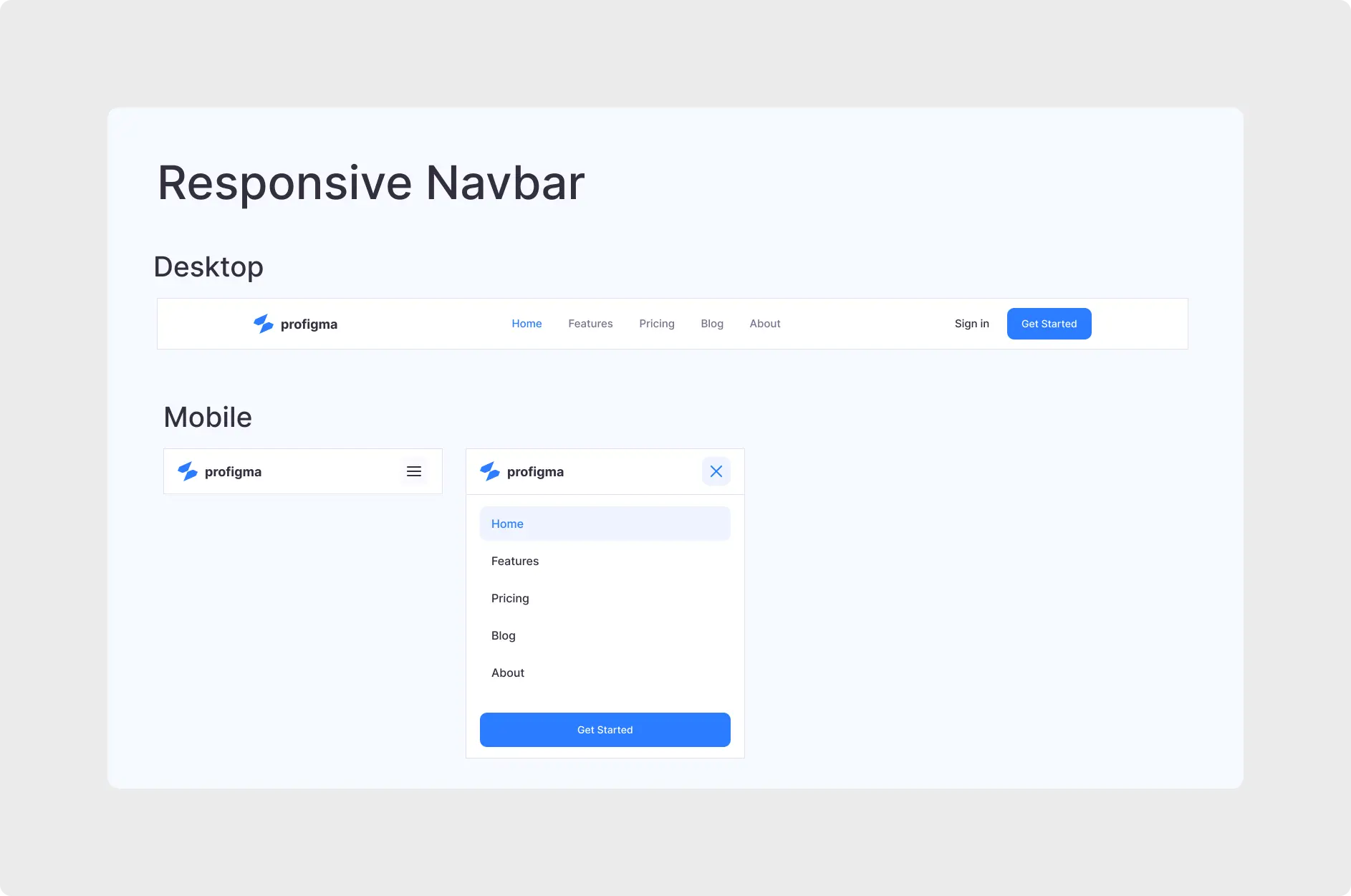
This kit covers the three navbar states every web project needs: a Desktop Navigation bar with a horizontal link layout, a logo, a Sign In text link, and a prominent “Get Started” CTA button; a Mobile Collapsed state showing the logo and a hamburger menu icon (≡); and a Mobile Expanded state displaying a clean dropdown drawer with all five navigation links, a highlighted active state on the current page, and a full-width “Get Started” button at the bottom. Everything follows a crisp, minimal design language using a blue accent palette on a white background — professional SaaS style, out of the box.
The active link state is already built in — “Home” is shown as selected in both desktop and mobile variants, making it trivial to adapt for any active page in your project. The ProFigma logo and nav item labels are fully editable text layers, so swapping in your own brand takes seconds rather than minutes.
Full horizontal layout with logo, five nav links, active state, Sign In link, and a solid CTA button — exactly what every SaaS homepage needs.
Minimal mobile header showing only the logo and hamburger icon — clean, distraction-free, and immediately recognisable to users.
Open dropdown drawer with all nav links, active highlight, close (✕) button, and a full-width CTA — the complete mobile navigation experience.
✦ Key Features
- ⚡ Figma Auto Layout — Built end-to-end with Figma Auto Layout so the navbar stretches and collapses intelligently — no manual frame adjustments needed.
- 🎨 Global Styles & Variables — Update your brand colour, logo, or typography in one place and every navbar state reflects the change instantly.
- 🗂️ Organised, Named Layers — Every frame, group, and text layer is named and structured for seamless developer handoff and team collaboration.
- 🍔 Hamburger Menu — Both States — Open and closed mobile states are both included, with a close (✕) button and smooth visual hierarchy in the expanded drawer.
- 🔵 Active Link State — The currently active navigation item is pre-styled with a blue highlight, ready to adapt to any page in your site structure.
- 🚀 CTA-Ready — Both “Sign In” and “Get Started” actions are included in the desktop view; the mobile expanded state features a full-width CTA button for maximum conversion.
Navigation is one of the most critical usability touchpoints on any website — poor nav patterns are a leading cause of user drop-off. This Figma Responsive Navbar UI Kit follows the navigation design principles outlined in the Nielsen Norman Group’s navigation research, ensuring your users always know where they are and how to get where they’re going. With mobile usage consistently exceeding desktop for many SaaS products, having a polished, fully designed mobile nav state is no longer optional — it’s essential.
🎯 Best For
- ✔ SaaS product teams designing landing pages
- ✔ Freelance UI/UX designers on web projects
- ✔ Frontend developers referencing Figma specs
- ✔ Startups building their first web presence fast
Stop sketching the same navbar from scratch on every new project. Download this Figma Responsive Navbar UI Kit and get a desktop-to-mobile navigation system that’s ready to customise in minutes. Browse all Header & Navbar UI Kits on ProFigma to find the full collection of navigation components built for modern web design.