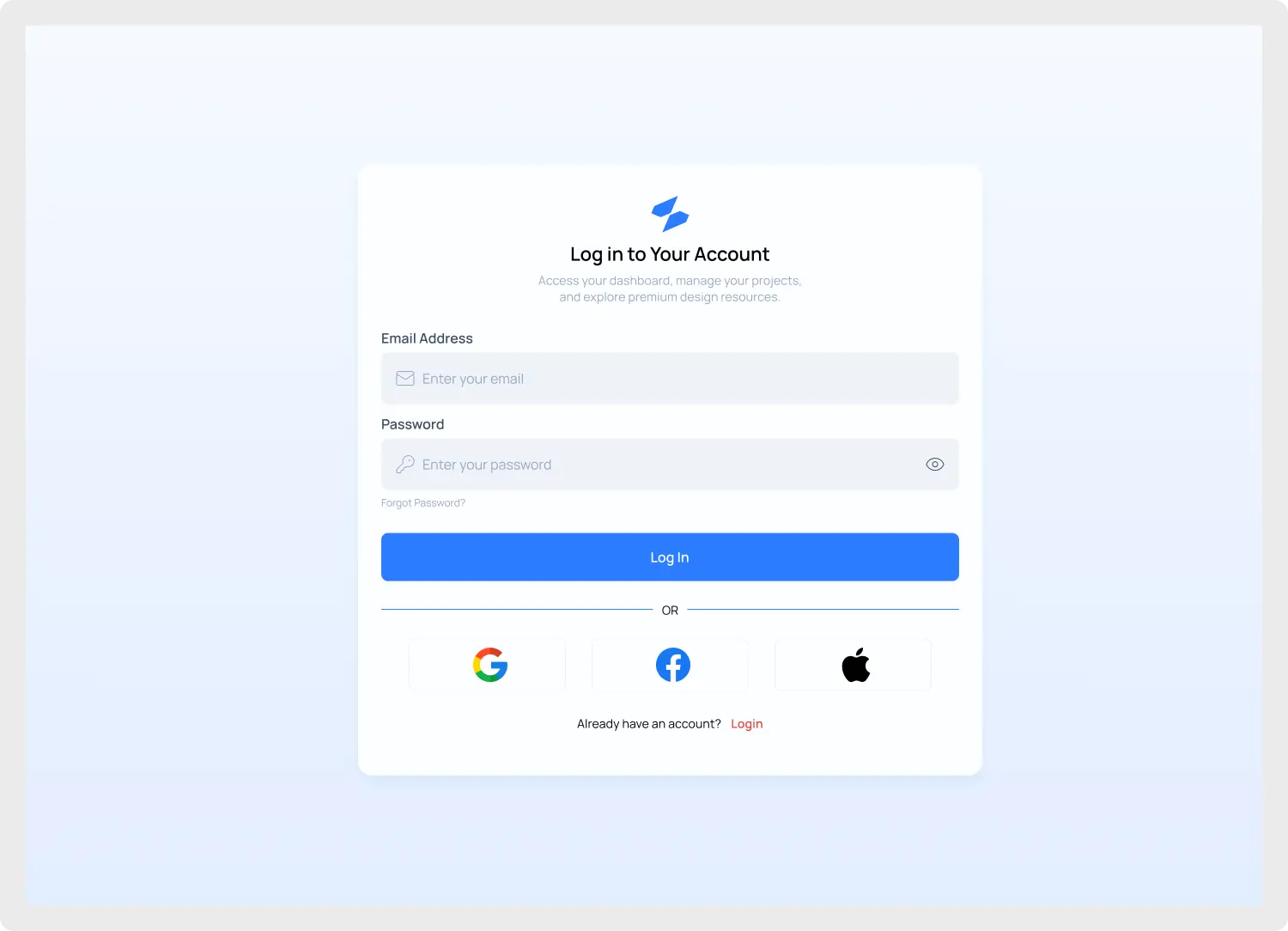
The Modern Login UI Component is an essential asset for designers looking to create a professional and high-converting entry point for their web applications. In the competitive world of SaaS, first impressions are everything, and a seamless authentication flow is the cornerstone of user retention.
Built with the latest design trends in mind, this template emphasizes clarity and ease of use. It features dedicated fields for email and password, a “forgot password” link, and a prominent call-to-action button. Recognizing the need for speed in modern UX, we have integrated social authentication buttons for Google, Facebook, and Apple, helping you reduce bounce rates during the sign-in process. By offering one-click access, you remove the friction that often leads to abandoned registrations.
Why Choose Our Modern Login UI Component?
This Modern Login UI Component was developed to solve the common headache of building authentication screens from scratch. Every element is crafted using Figma Auto Layout. This ensures that the component remains fully responsive, allowing you to resize containers while maintaining perfect padding and alignment effortlessly. It also utilizes global color and text variables, making it incredibly easy to reskin the component to match your brand’s unique identity in seconds.
To ensure your project meets global standards, this component was developed following the Web Content Accessibility Guidelines (WCAG). From high-contrast text to clear focus states, your authentication flow will be inclusive and user-friendly for everyone. Accessibility is no longer an afterthought; it is a requirement for modern web design, and this component puts it front and center.
Mastering the Figma Authentication Template
Working with a Modern Login UI Component inside Figma shouldn’t be a struggle. We have optimized the layer naming convention to be developer-friendly, meaning your engineering team can inspect the CSS properties with zero confusion. This bridge between design and development is what separates premium UI kits from basic placeholders. Furthermore, we have included various states—hover, active, and error—so you can present a complete user journey to your stakeholders without having to design extra frames.
If you are looking for more ways to enhance your application’s layout, be sure to browse our full collection of UI Components. We also offer specialized layouts in our Dashboards section that pair perfectly with this login screen for a cohesive end-to-end user experience.
Key Features
- Full Figma Auto Layout 5.0: Support for fluid responsiveness across desktop and mobile.
- Social Authentication: Pre-styled icons for Google, Facebook, and Apple logins.
- Clean Minimalist Aesthetic: Optimized for modern SaaS and Enterprise-grade applications.
- Global Styles: Use Figma variables for rapid color and typography updates.
- Developer Ready: Organized layers and consistent naming for easy handoff.
- Comprehensive States: Includes default, hover, and error feedback designs.
Best For
Whether you are building a boutique platform or a massive scale application, this login interface fits perfectly into any professional workflow. It is particularly ideal for:
- SaaS Startups: Looking for a “Pro” look out of the box to impress investors.
- UX/UI Designers: Who need to speed up their wireframing and high-fidelity prototyping.
- Freelancers: Delivering high-quality, polished designs to clients under tight deadlines.
- Frontend Developers: Seeking a clean visual guide for CSS and React/Vue implementation.
Don’t let a clunky login screen hold back your conversion rates. By utilizing a Modern Login UI Component, you ensure that your platform feels modern, secure, and professional from the very first click. This asset is more than just a template; it is a foundation for your user’s trust. Download it today and stop wasting time on basic layouts, allowing you to focus on the core features of your product.